The baseball playoffs started this week in earnest, with the Cincinnati Reds carrying Buckeye State’s hopes for a pennant (next year for sure, Cleveland fans). This year’s playoffs includes teams with varying levels of economic resources—from the high-spending New York Yankees, to the low-spending, upstart Oakland A’s. Yet, all these teams have proven themselves to be successful over the long regular season.
Schools districts, like baseball teams, are similarly endowed with varying amounts of economic resources. And like baseball teams, some districts get a lot for their money—the Oakland A’s of school districts—while others get little for their money. “Efficiency” generally describes whether an organization gets a lot or a little out of the resources they put in.
To look at which schools are more efficient, we use Ohio public school districts’ expenditure per equivalent (EPE) and performance index score (PI). EPE is the district’s input (the money it expends) and PI is the output (what it gets for the money: namely, student achievement). The Ohio Department of Education (ODE) has developed both of these measures.
- EPE is a weighted per-pupil expenditure that accounts for the higher cost of educating poor, English language learning, and special needs students. ODE reports official EPE data for traditional districts (there is not official, publically-accessible data for charter schools, so they are excluded from this analysis).
- PI is a weighted proficiency average, with greater weight given to students who score at higher levels of achievement on the state’s standardized exams.
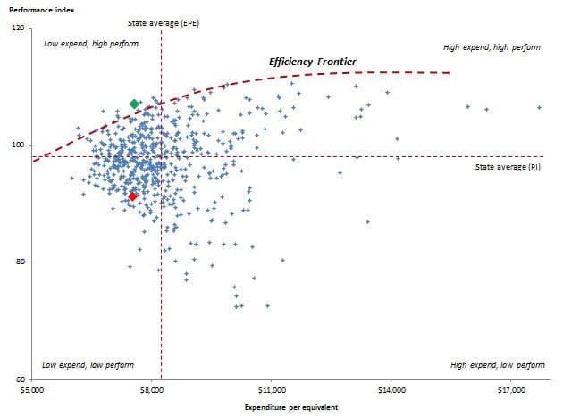
For the sake of simplicity, this analysis is a bird’s-eye view with limitations, some of which are included in the following footnote.[1] Figure 1 below shows each of Ohio’s traditional school districts as a point on the chart, indicating the intersection of EPE and PI for each district in the 2009-10 fiscal year and school year, the last year that EPE data is available on ODE’s website. The chart shows two things that help us understand district efficiency: (1) the efficiency frontier, which is marked in the thick dashed red line and (2) four quadrants that are descriptively labeled by expenditure and academic performance (e.g., low expend, high perform), relative the state averages for PI and EPE. The averages are marked-off by the thin dashed red lines.
Figure 1: Estimation of school district efficiency, performance index versus expenditure per equivalent, 2009-10, Ohio traditional public school districts

Source: Ohio Department of Education, Education Fiscal Data Project
First, the efficiency frontier, a term used by economists: The districts along the frontier indicate the most efficient schools, using the metrics chosen here. (The curve is eyeballed, not mathematically derived.) Districts on the interior of the frontier are less efficient than those on the frontier. For instance, consider Fort Laramie Local, which resides on the frontier. It gets more PI out of the same expenditure than, say, Eastern Local. Fort Laramie (point shown in bright green) spends $7,561 and has a PI of 107; meanwhile, Eastern (point shown in bright red) spends $7,516 EPE and has a PI of 91.
Second, I mark-off quadrants that show four types of school districts, based on their EPE and PI relative the statewide means. The top left quadrant (low expend, high perform) shows districts that spend less than average, but receive better than average achievement. These districts are generally efficient (though, even among this group, there are more efficient districts—those that lie on the frontier). Meanwhile, districts in the bottom right quadrant (high expend, low perform) are unquestionably inefficient: they expend a lot and get little achievement.
The analysis here is a simple but useful tool for identifying the efficiency of Ohio’s school districts. Surely, further research needs to be done to identify more precisely which districts are efficient according to multiple measures of input and output. This would require a more sophisticated analysis. Further, the analysis doesn’t attempt to explain why and how some districts achieve greater efficiency than other districts. Better management? Smarter use of technology? More effective teaching? Any of these variables could improve the efficiency of a given school district.
Businesses—and even baseball teams (like this year’s low-spending, playoff-bound Oakland A’s)—have figured out how to become leaner and more efficient, without sacrificing the quality of the output. With the flat-lining of resources available for education, it’s time that schools also learn to be efficient. Efficiency doesn’t mean that that kids have to lose; as we’ve seen, there are districts that spend less and get a lot from their kids.
[1] The analysis, for example, assumes that all districts seek to maximize PI (which may not be the case—some may want to maximize, e.g., the number of students who pass AP tests), that PI is the only measure of academic achievement (it doesn’t incorporate Ohio’s value-added metric), and that each district has the same resource and political constraints. The analysis is also for a single period only. More complex methods of analyses could be applied to address these limitations: see, for example, the World Bank’s website on public spending efficiency.
